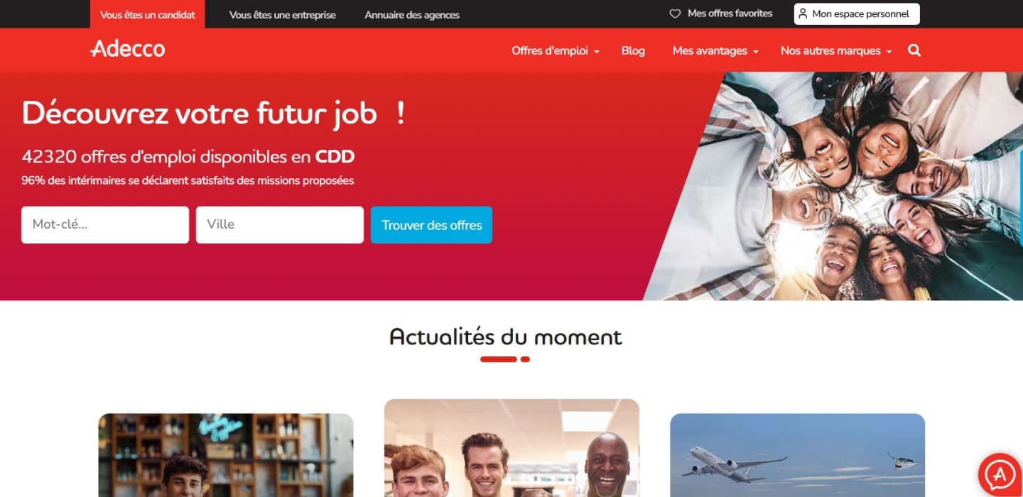
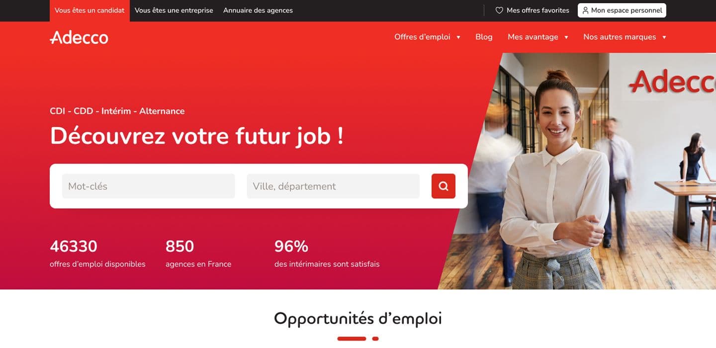
Improving a high-traffic entry point
With tens of thousands of users landing on Adecco France's homepage each day, the experience had become cluttered, text-heavy, and hard to navigate.
My mission: modernize the design, cut the noise, and rebuild a clearer path for users to find what they need.

Research, prototyping, testing
After benchmarking and analyzing user behavior, I identified the homepage’s key usability problems. I created a clearer, more intuitive prototype, then tested it internally and with real users. A/B testing and interviews helped refine the design to match user needs.
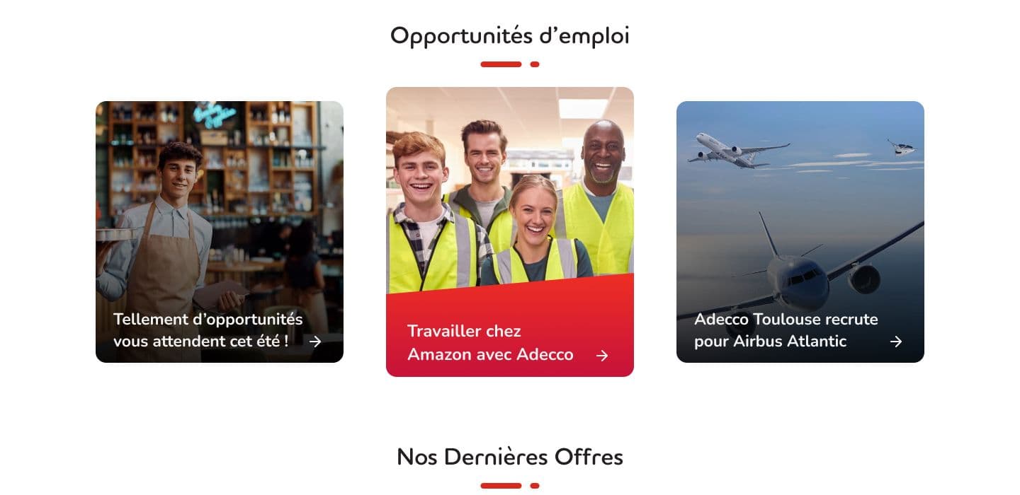
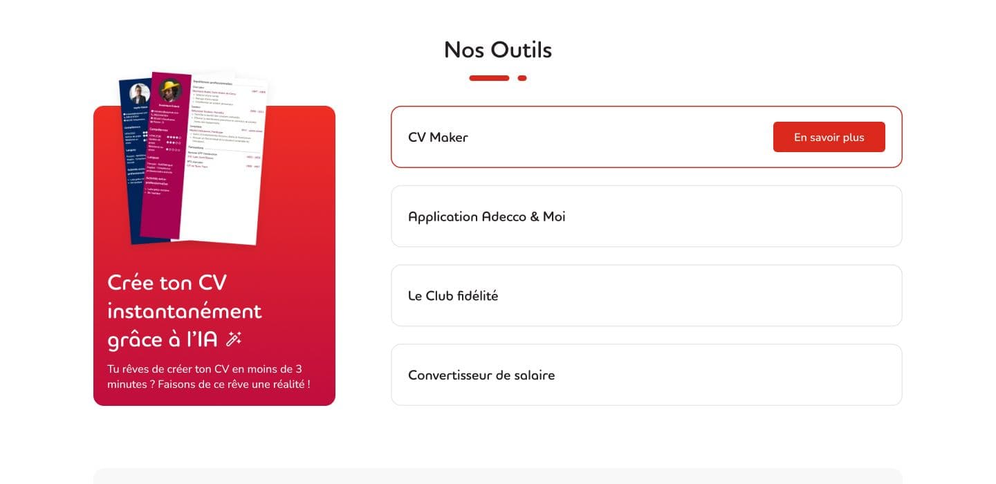
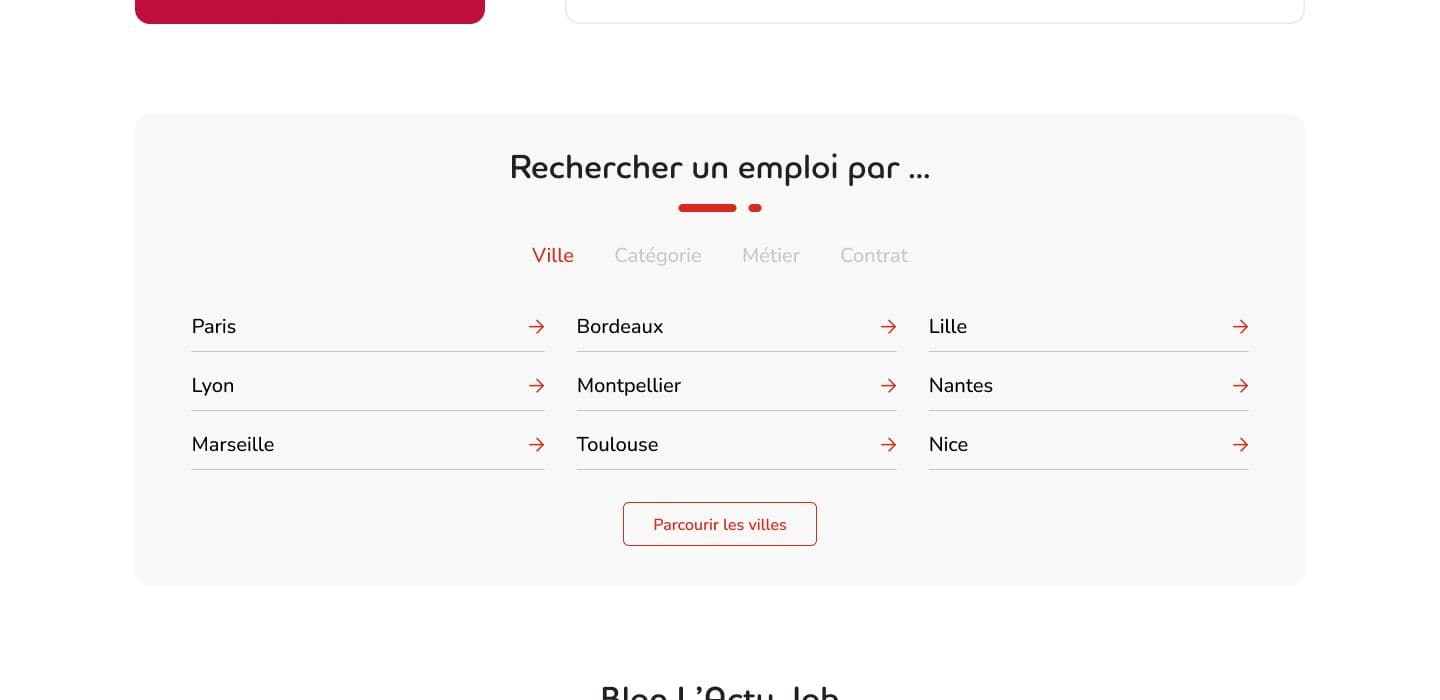
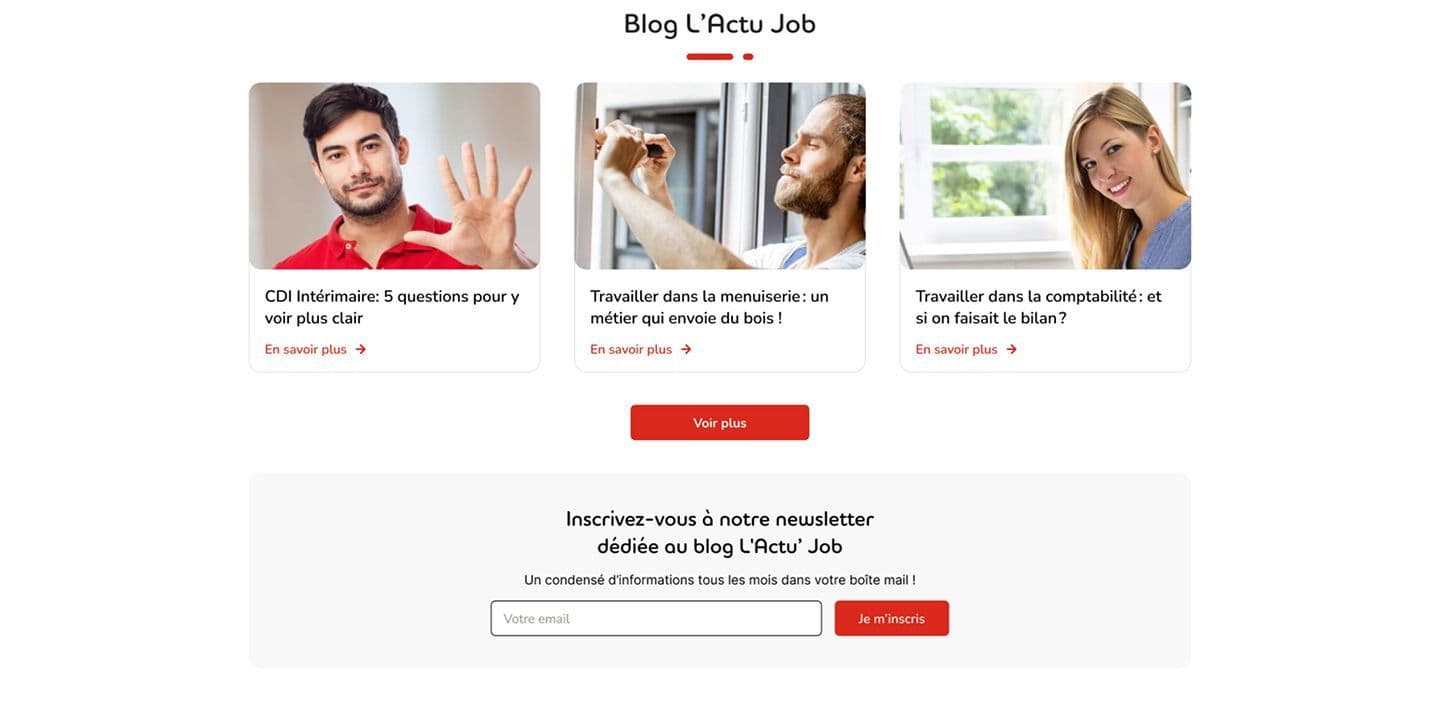
Cutting the noise to let users find their way
The original homepage tried to say everything at once. I redesigned it to say only what mattered. By focusing on user intent and simplifying each section, the new version feels lighter, clearer, and far easier to navigate.

Did the redesign deliver results?
A year after launch, I analyzed behavioral data to see if the redesign worked.
At first glance, the redesign didn’t bring major changes to overall site performance. But looking deeper into the data, I found higher user engagement in key areas like the search bar, blog, and job categories. The redesign didn’t transform everything, but it did make the experience clearer and more intuitive for users.
users reaching the end of the page (desktop)
clicks in the Blog section (all devices)
clicks in the Featured Tools section (all devices)
job search bar usage (all devices)
interaction rate in the Job Category section (all devices)