
Problem
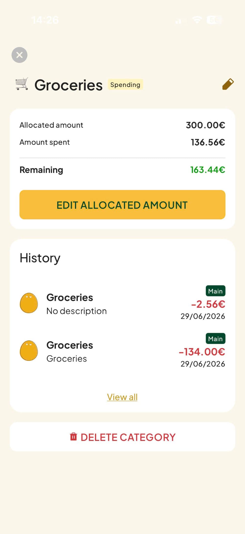
Eggu is a budget app for young professionals built on zero-sum budgeting — a powerful and proven method, but still new and complex for most users.
Eggu launched with a basic self-check onboarding — a checklist users had to complete and tick off themselves. It was built quickly to ship the app, not to teach the method. The team knew it was a placeholder, and I was brought in to replace it with something that could actually work.
In a crowded market of budgeting apps, the onboarding had two jobs to do:
- Explain what makes Eggu different from every other budgeting app
- Teach users how zero-sum budgeting actually works — a method that's powerful but unfamiliar to most people
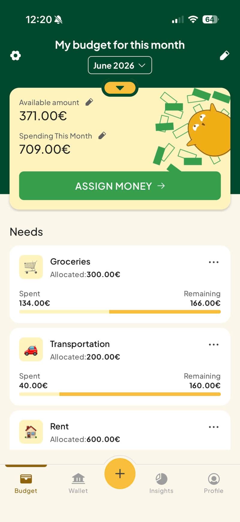
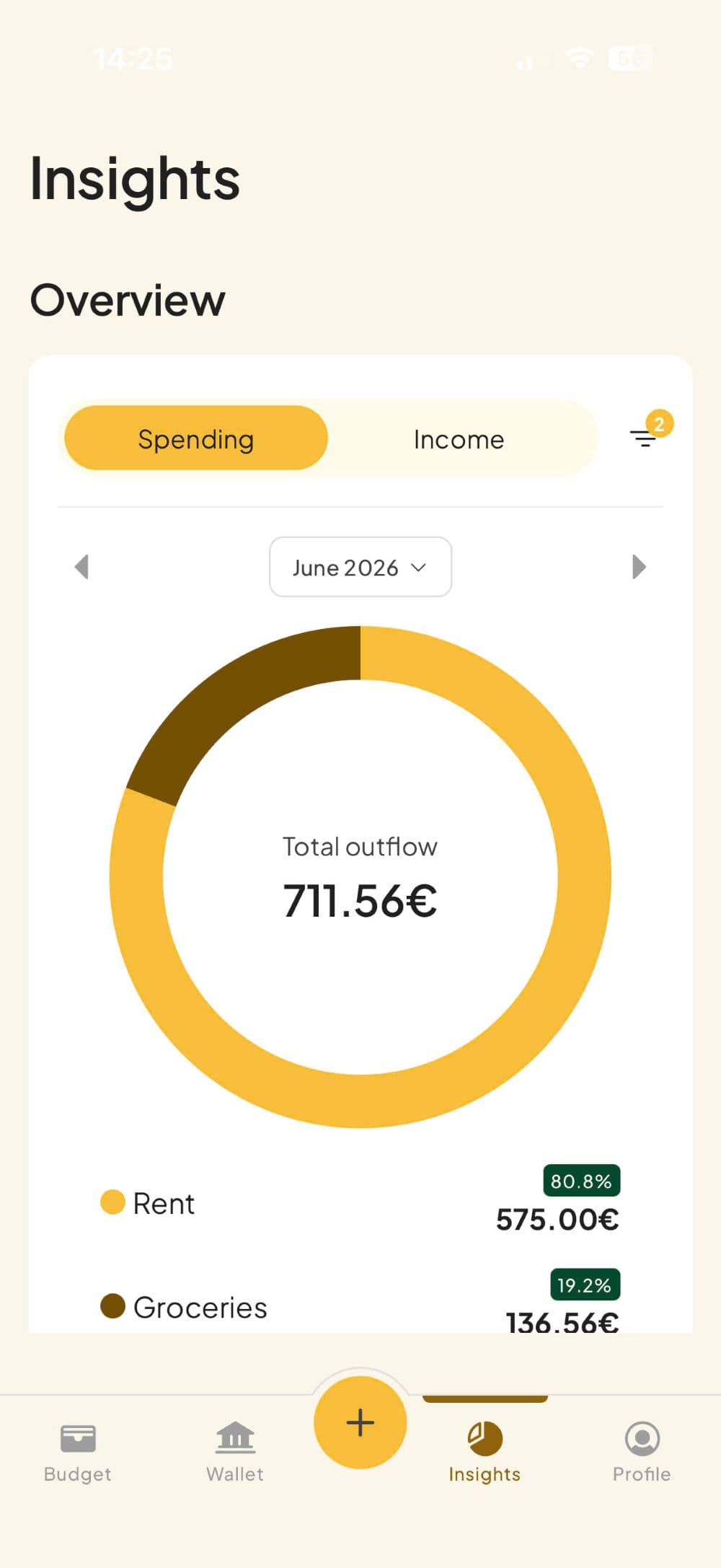
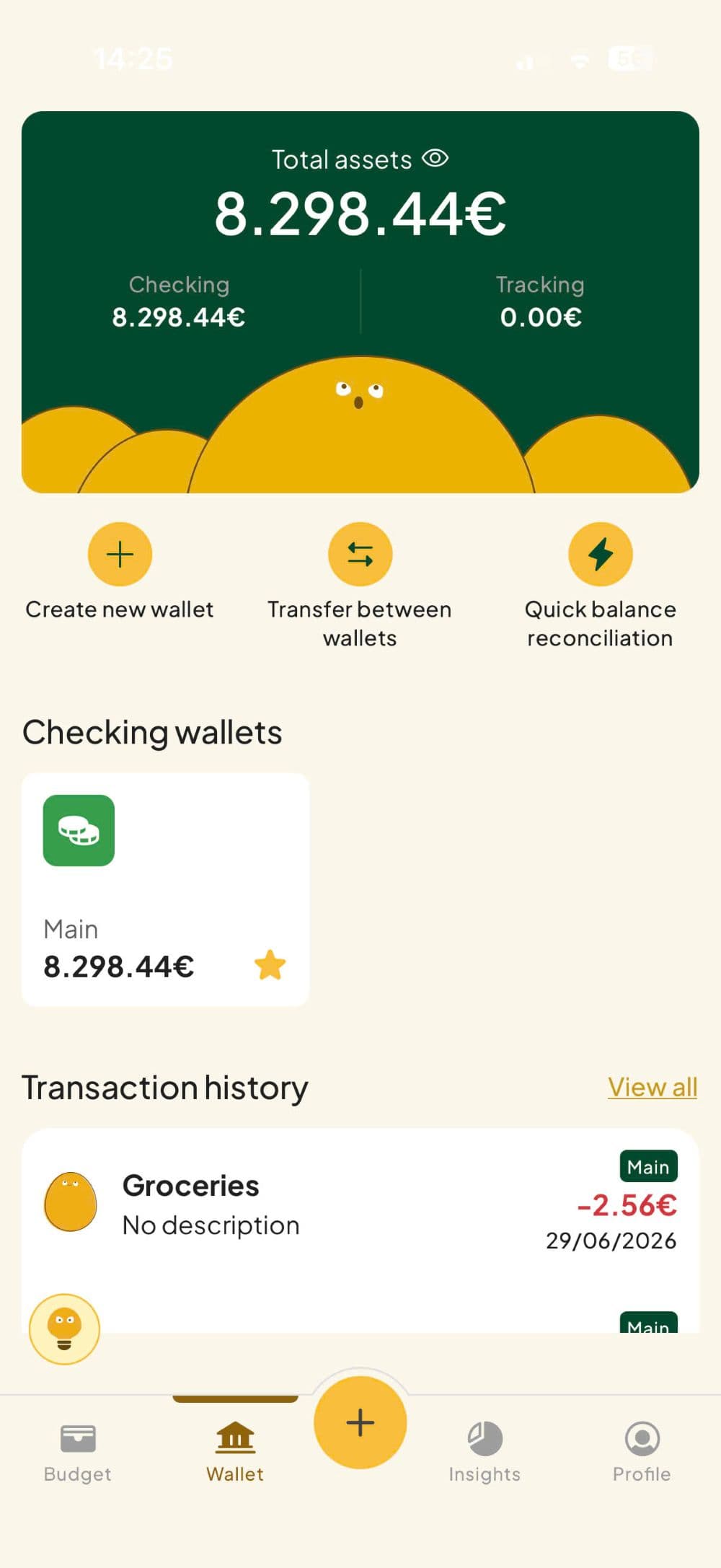
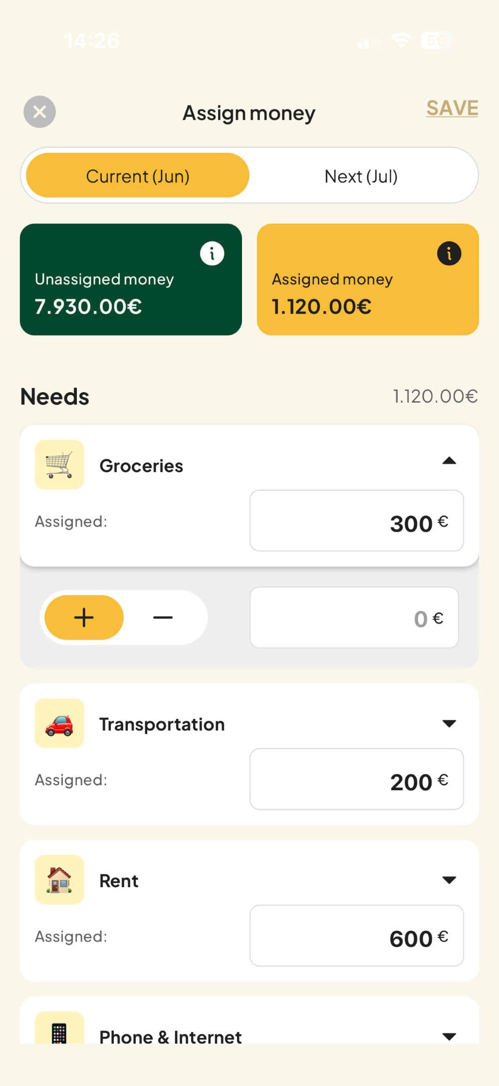
Research
I benchmarked any product that has to teach a new mental model — budgeting apps, banking apps, complex productivity tools. Rather than looking for a single pattern to copy, I was looking for what each approach did well and where it broke down. Four patterns stood out, each solving a different piece of the onboarding problem.
- Headspace nails the emotional hook — you feel the benefit before you understand the product.
- Blinkist makes you feel seen immediately through personalization.
- Duolingo proves that the fastest way to learn something is to just do it.
- Evernote shows how video can make a complex product feel approachable in seconds.
So instead of picking one, I combined them. The onboarding I designed layers these patterns deliberately: a welcome sequence borrowed from emotional storytelling, a setup flow that creates the illusion of personalization, and a tutorial that uses finger guides inside the real app. Each pattern covers a weakness in the others.
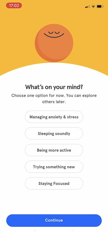
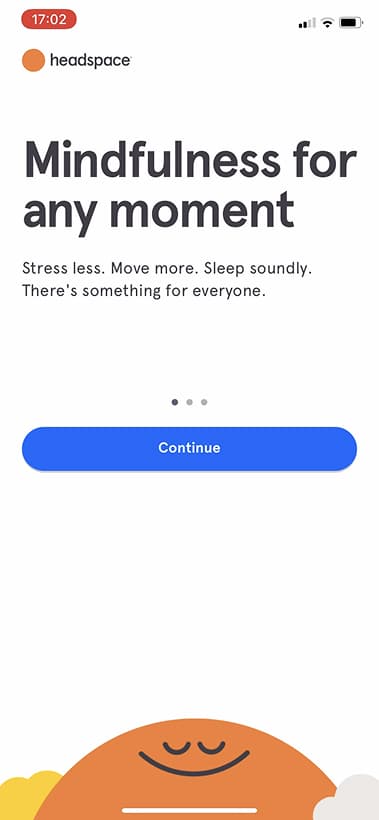

Headspace: Outcome-first welcome
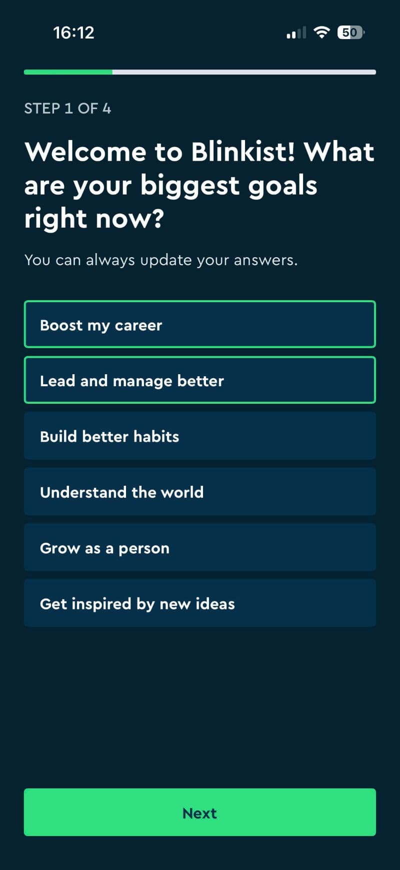
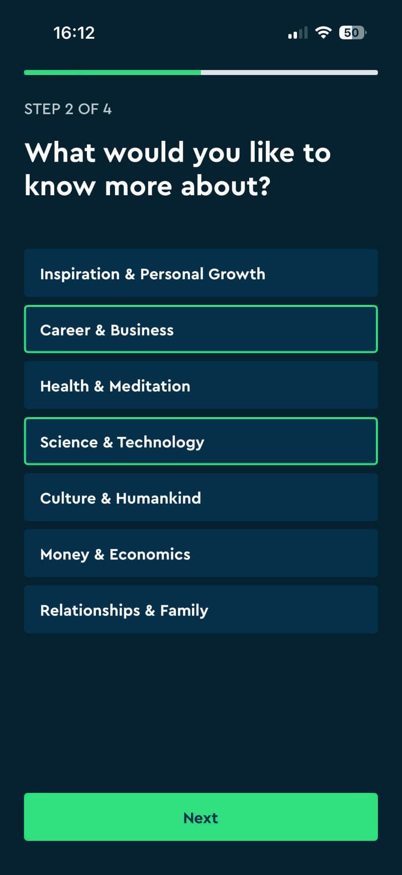
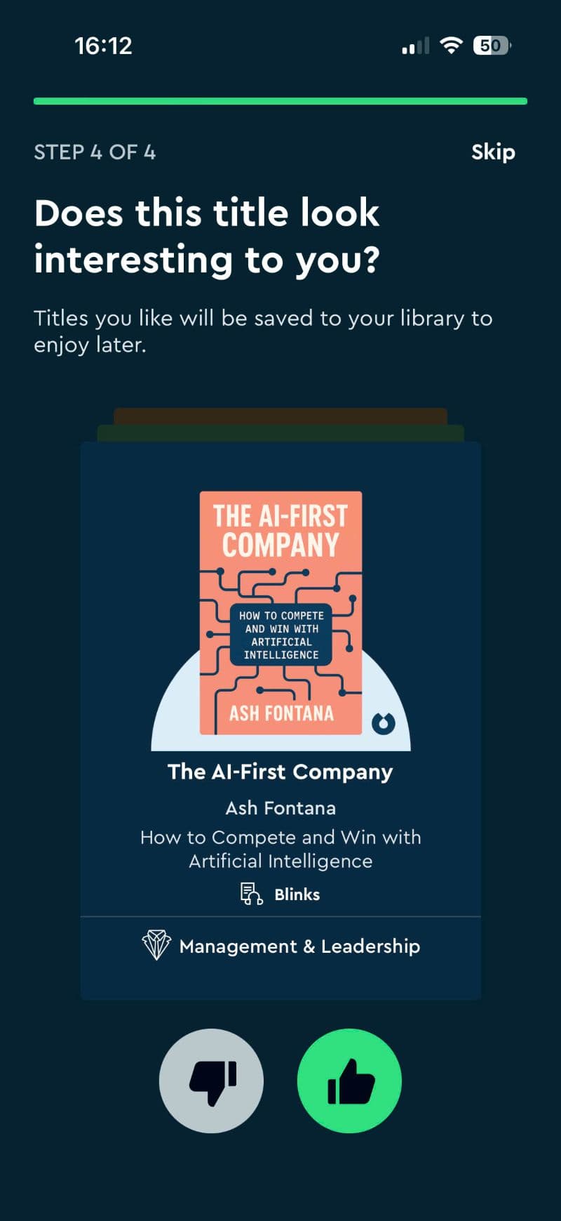
Blinkist: Personalization
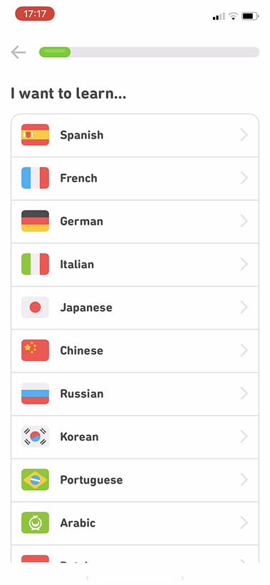
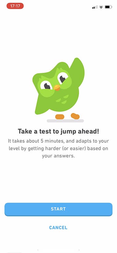
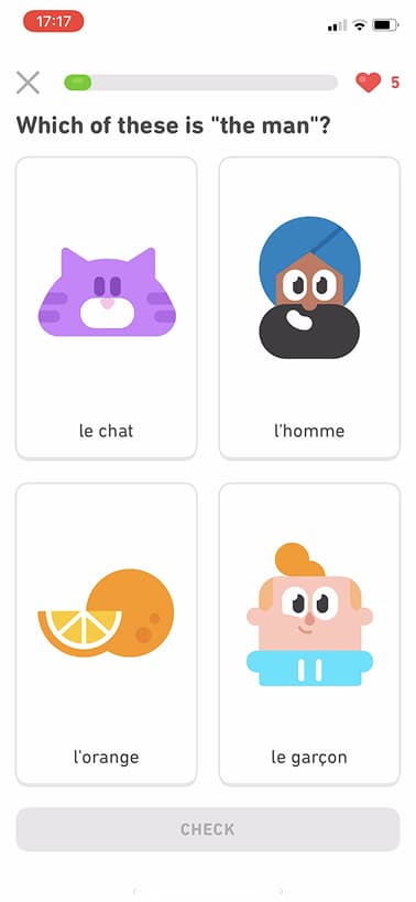
Duolingo: Learn by doing
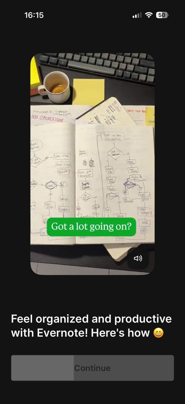
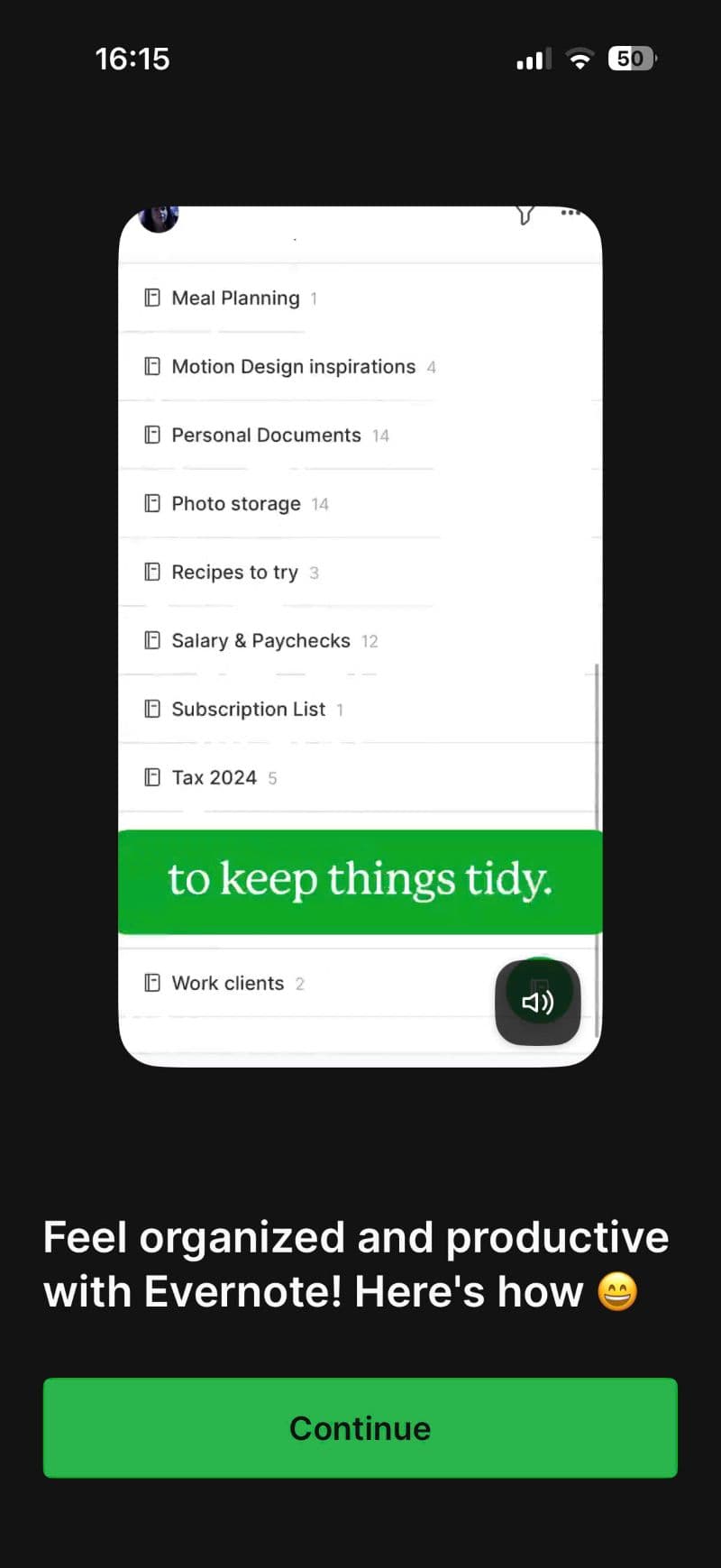
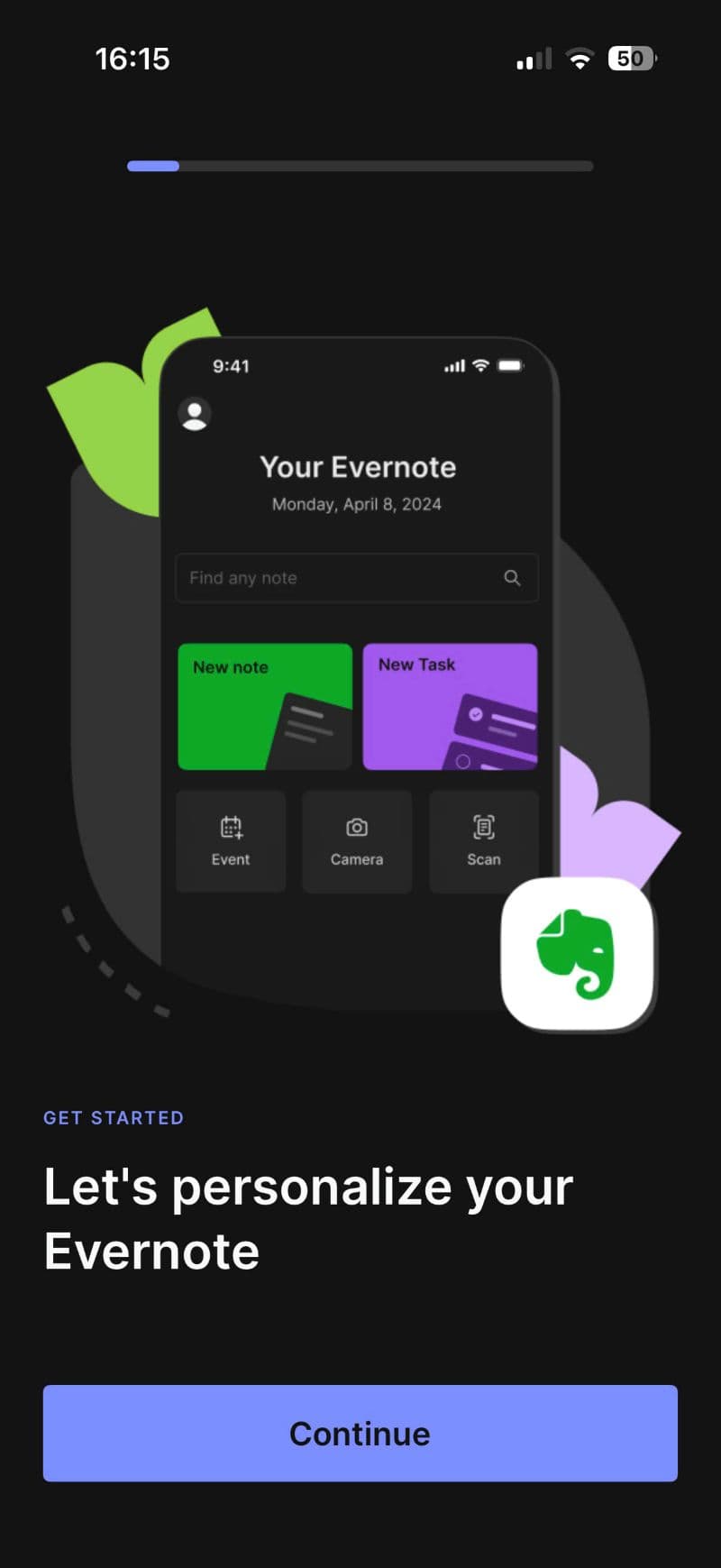
Evernote : Feature Walkthrough
Building the V1
DESIGN
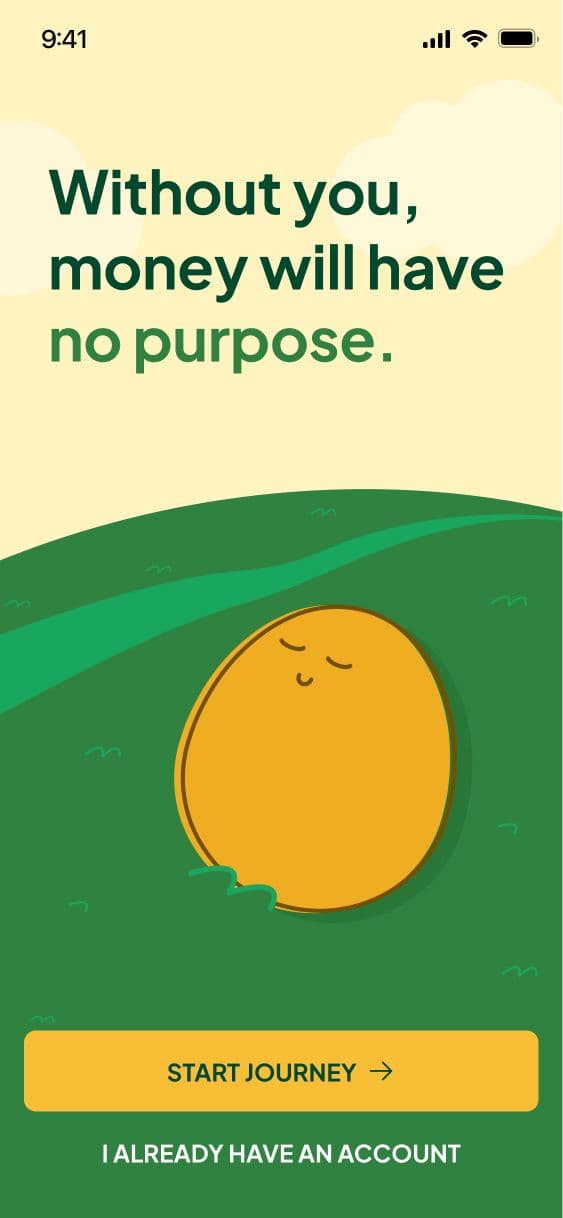
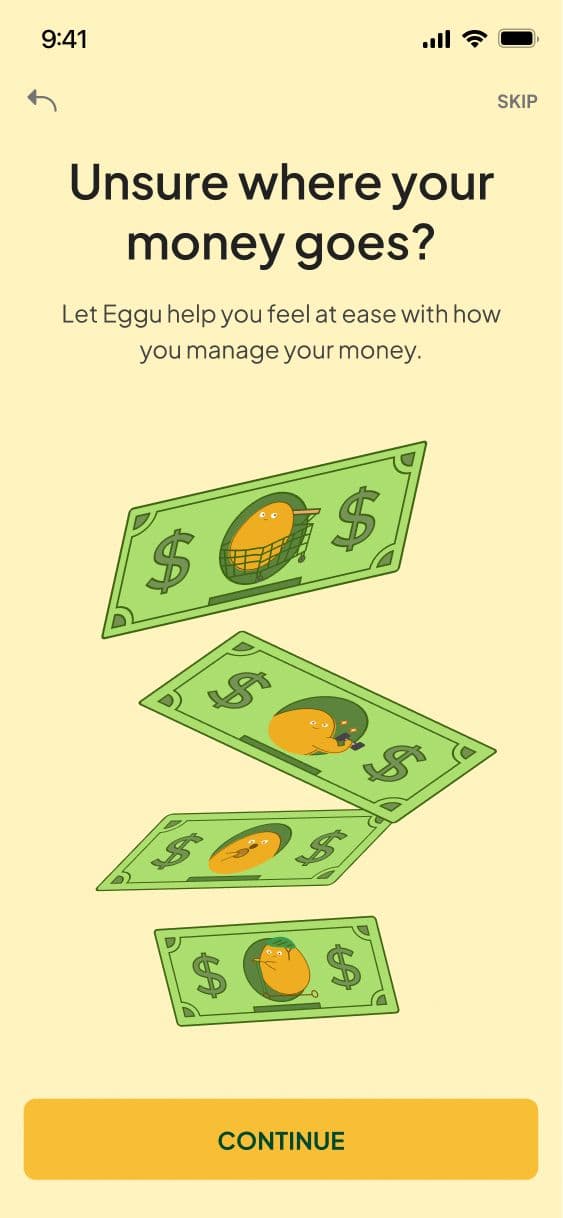
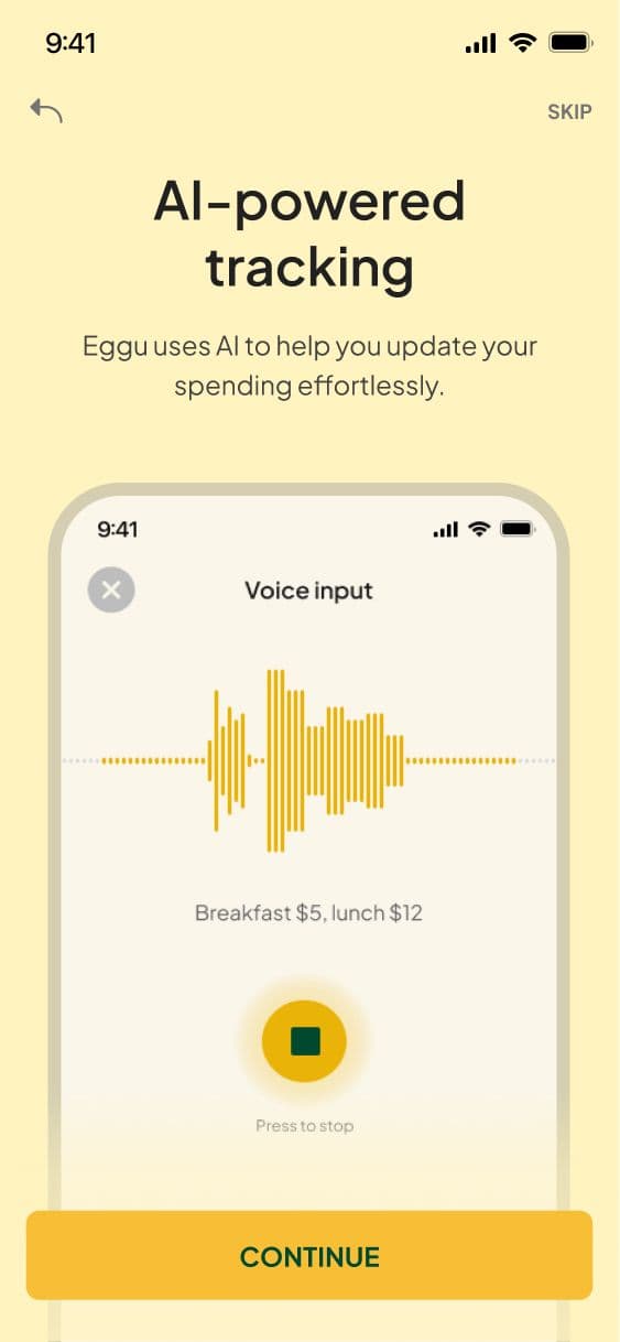
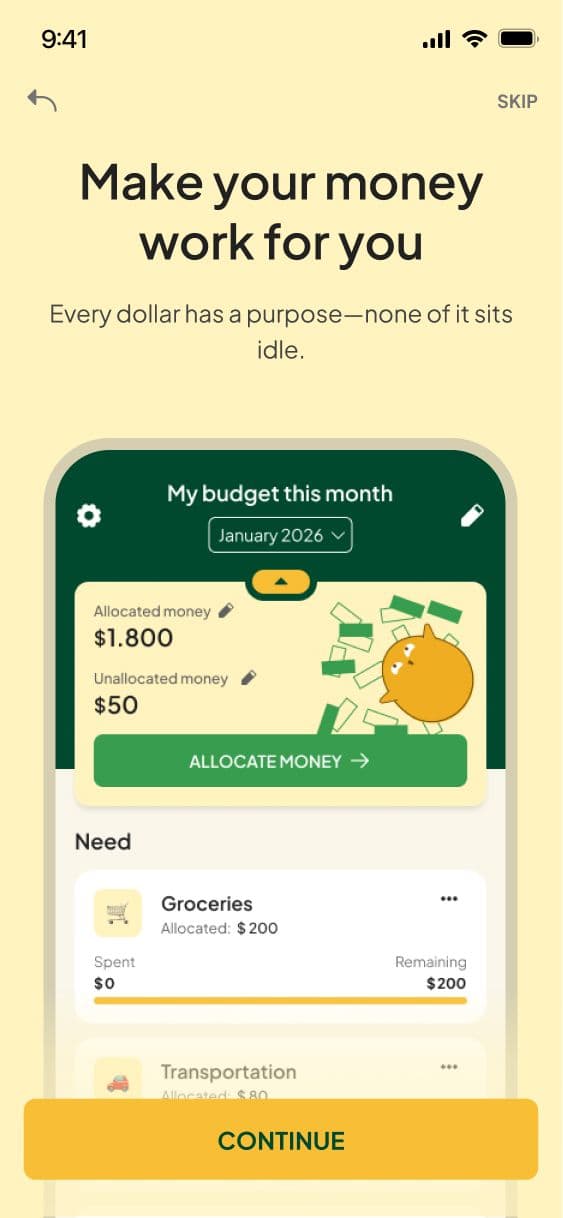
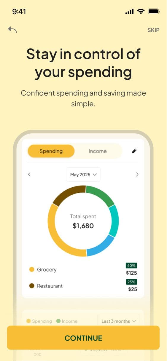
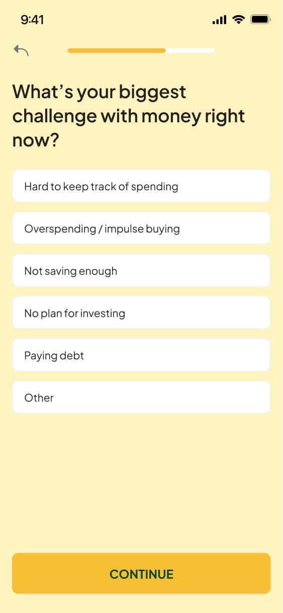
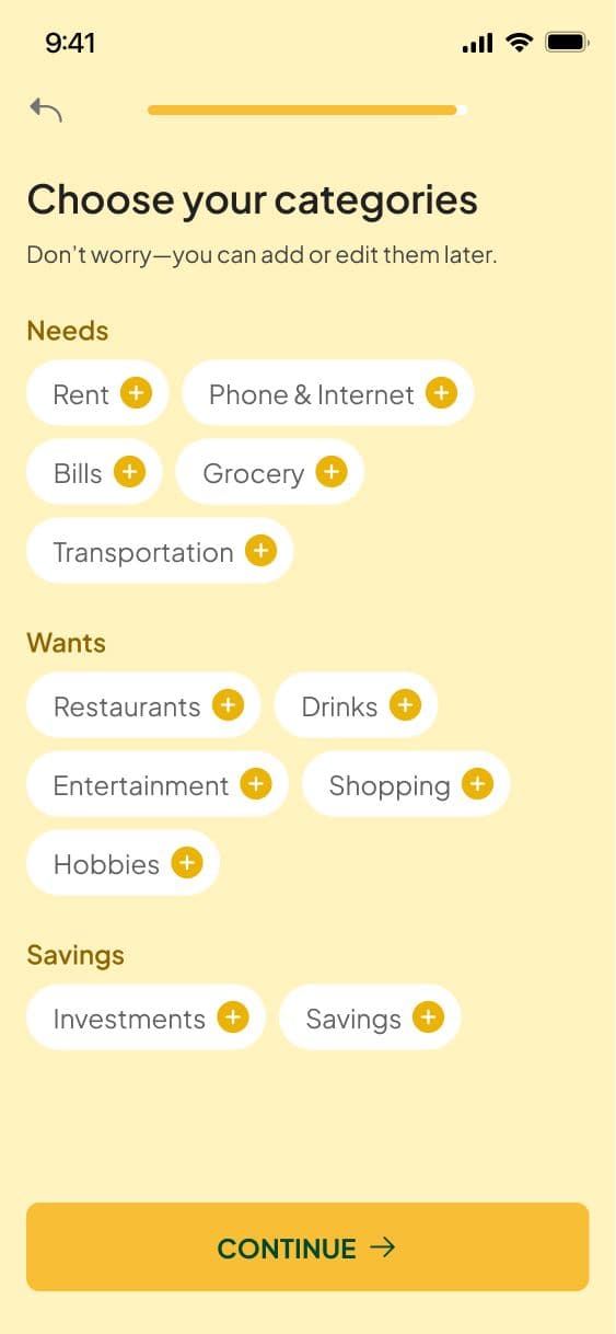
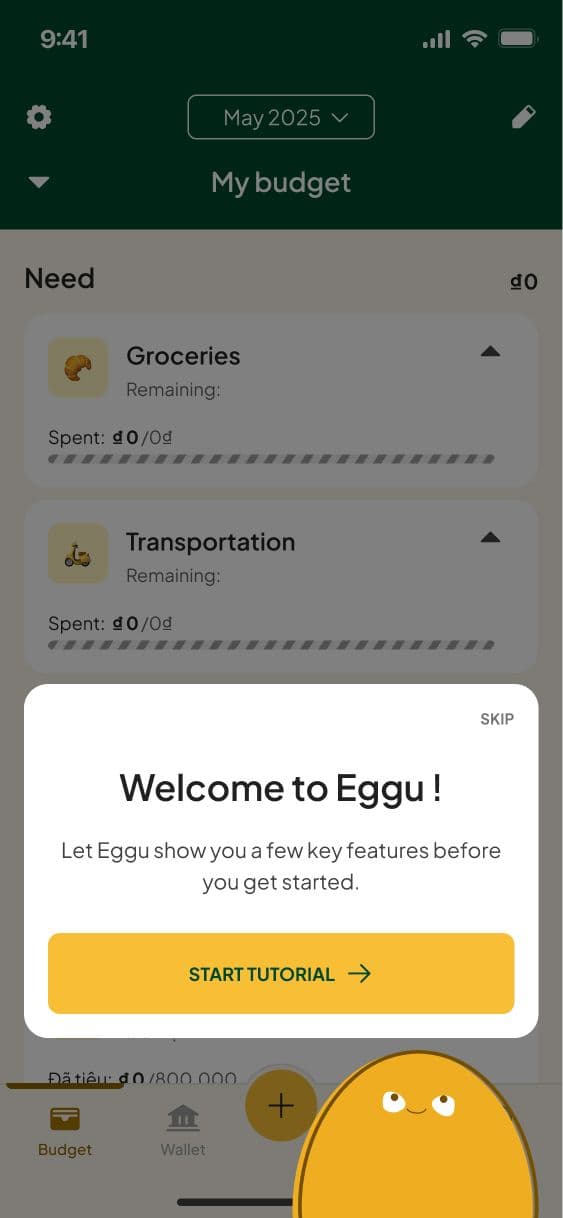
I structured the onboarding in 3 parts:
- Welcome: focused on outcomes and emotions, not features.
- Setup: a few questions to personalize the budget configuration from the start.
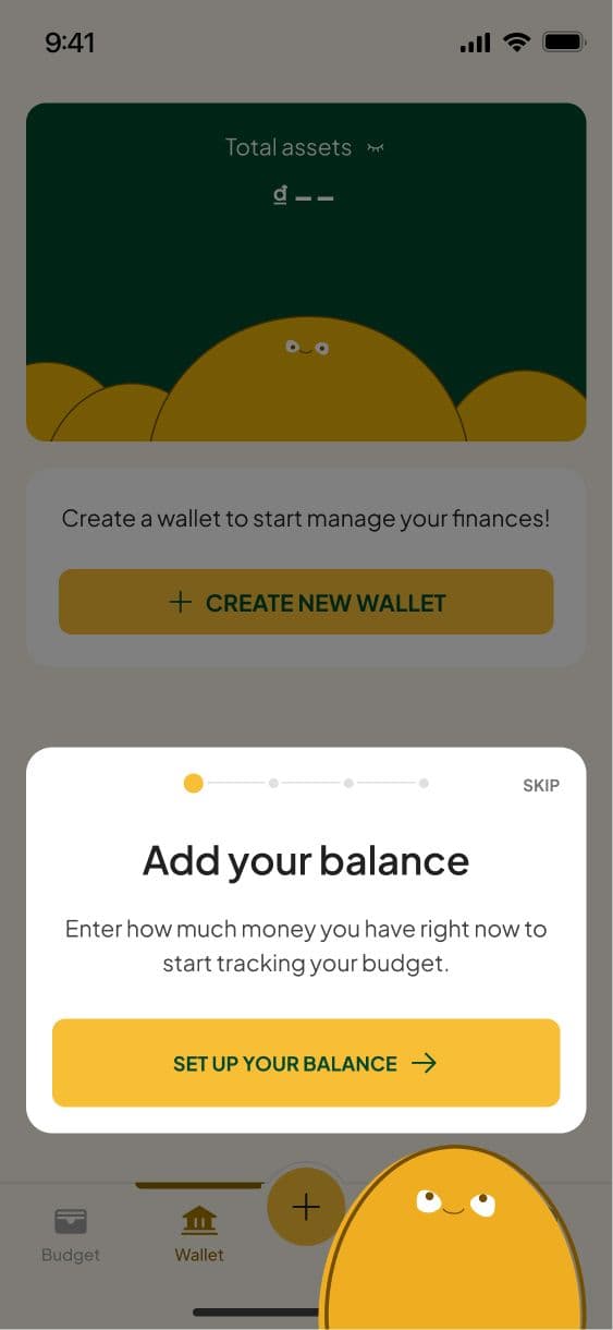
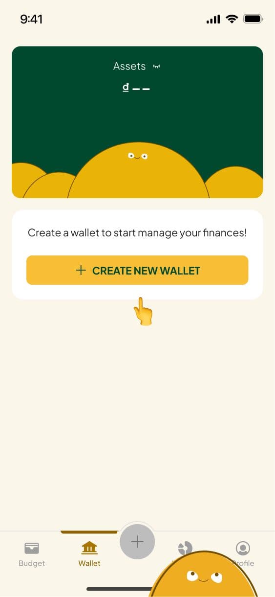
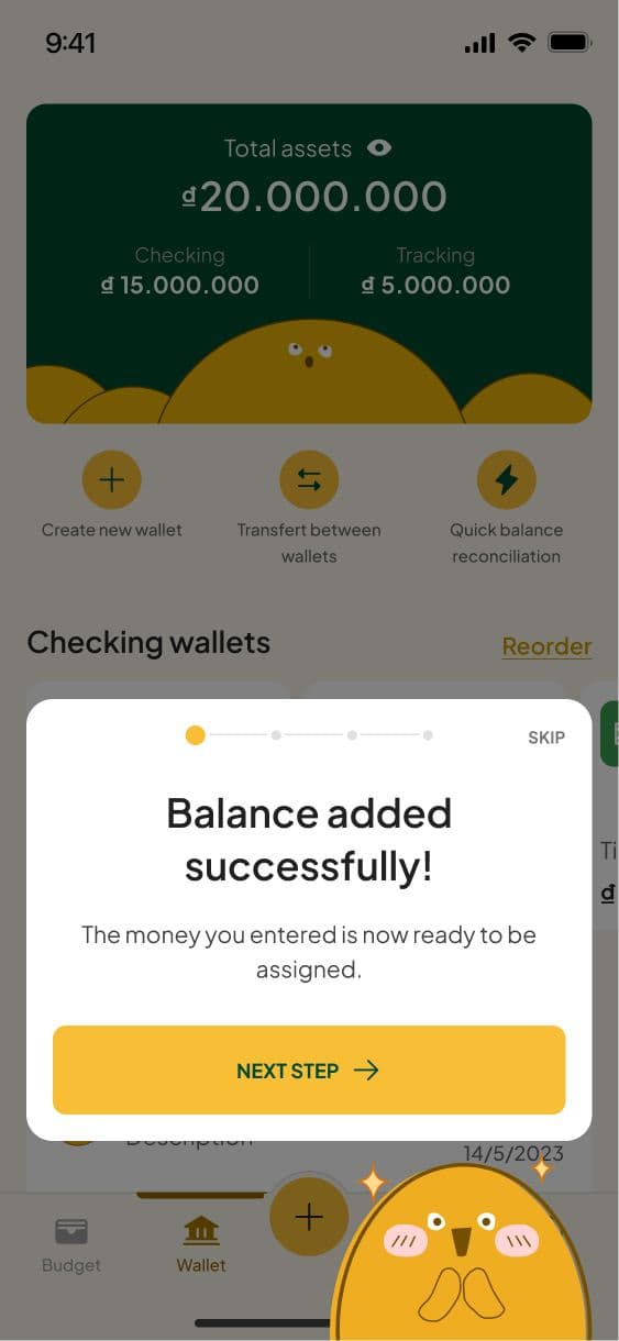
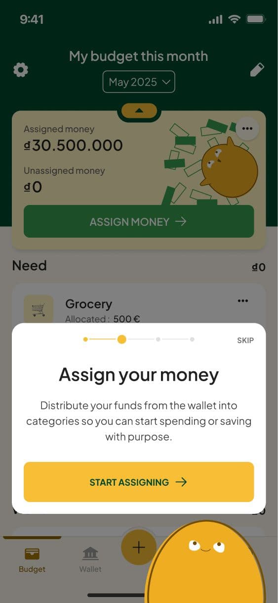
- Tutorial: 3 key steps covering the core app flow. Each step explains the goal briefly, then brings users into the real app with a finger guide showing exactly where to tap.
USABILITY TEST
I tested the prototype with 6 users. The key thing I observed was speed — users moved through each step without hesitation or confusion. Nobody got stuck. The finger guide in particular seemed to remove any friction around what am I supposed to do here.
After the test I made minor adjustments to the copy throughout, tightening the wording at a few steps where the intent wasn't immediately clear. The structure itself stayed unchanged.
We shipped V1.


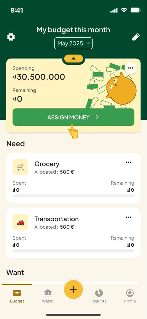
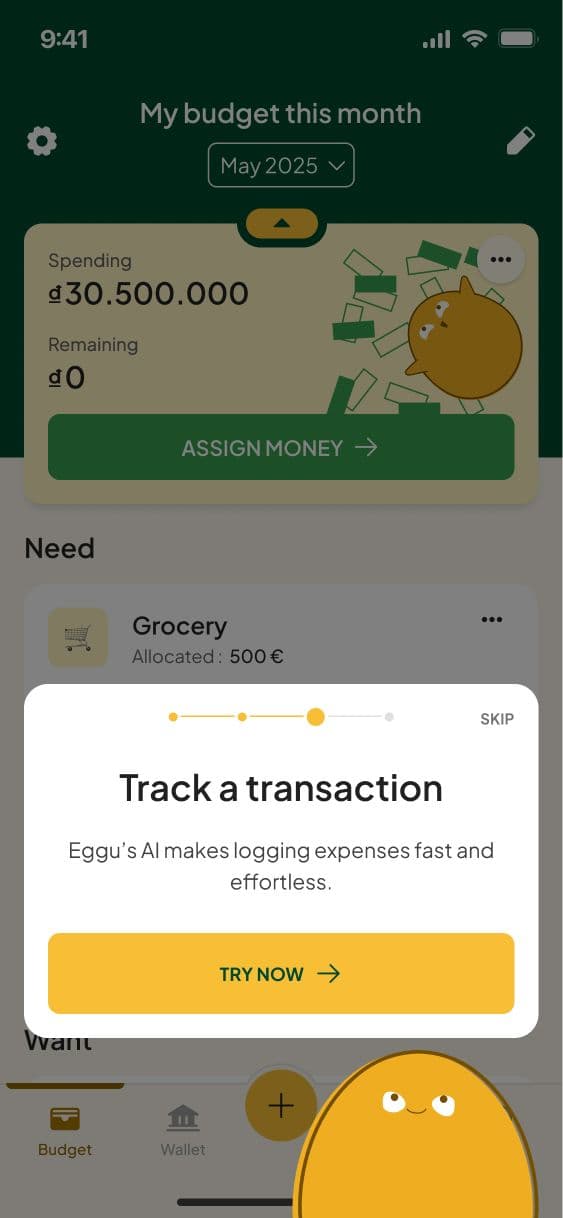
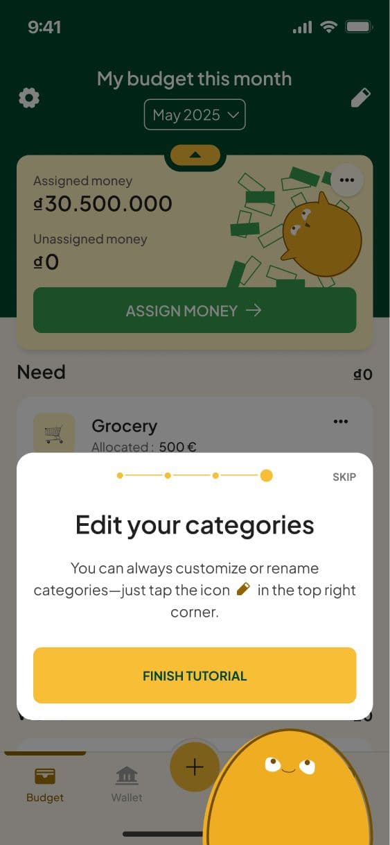
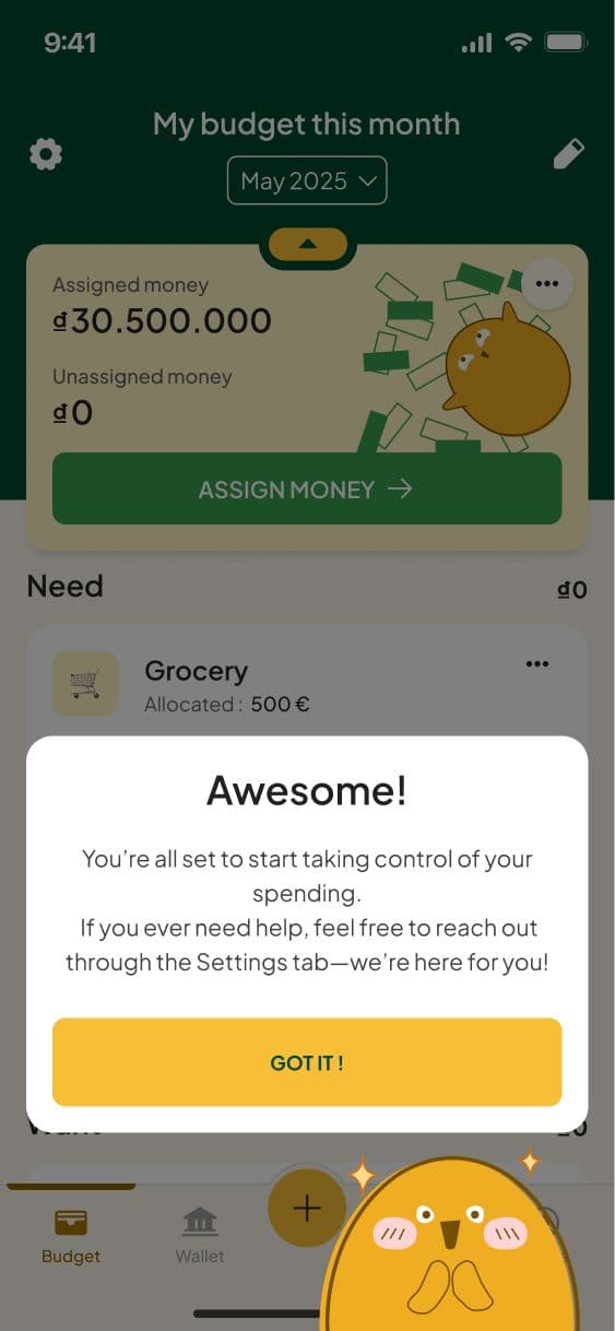
Iterate
ANALYSE DATAS
Two months post-launch, PostHog showed only 30% of new users completing onboarding, with drop-off after every step of the tutorial.
Analyzing the funnel data make the issue clearer: the original tutorial was a rigid sequence, one step after another. Each step asked for a real commitment - creating a wallet, setting a budget, personalizing categories - all are cognitive-heavy. First-time users wanted to explore the app and configure it on their own terms
GIVE USERS AUTONOMY
I redesigned the tutorial around autonomy instead of sequence. Instead of a linear series of steps, V2 introduced an interactive checklist:
- Each step can be completed independently, in any order
- The checklist stays visible and can be expanded or collapsed, so it never blocks the rest of the app
- Users can complete it fully, partially, or skip it entirely — without losing progress on what they've already done
- Each step still uses the finger guide from V1, pointing users to the exact interaction needed
I also added a 15-second video as the very first touchpoint, explaining the core concept of zero-sum budgeting before any hands-on steps begin. This gave users the why upfront
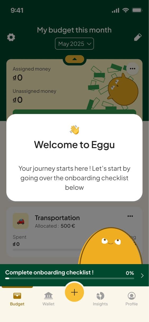
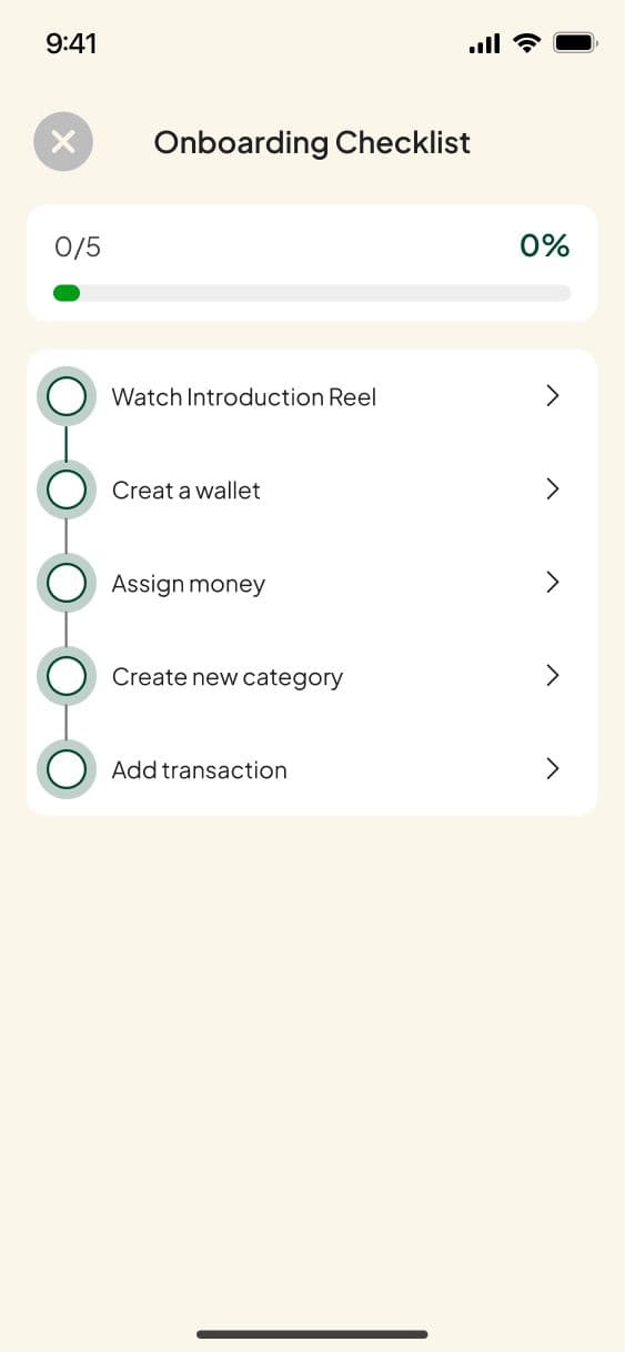
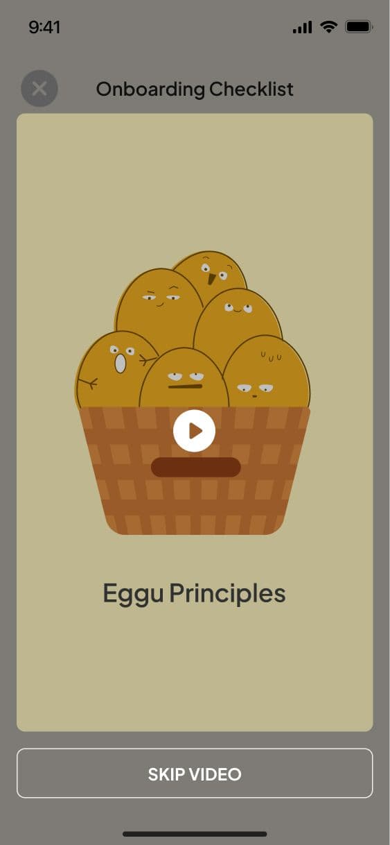
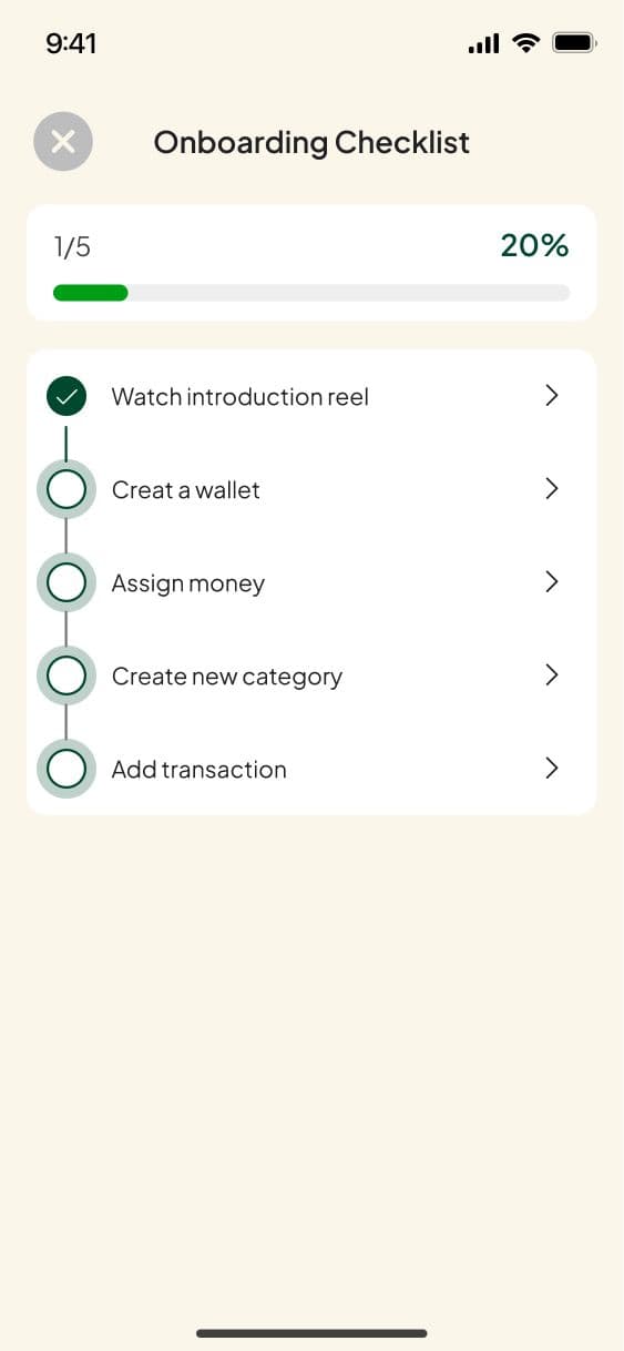
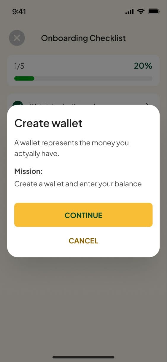
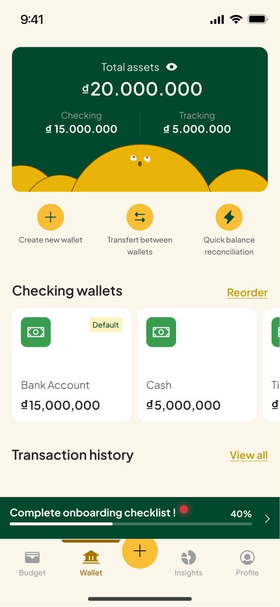
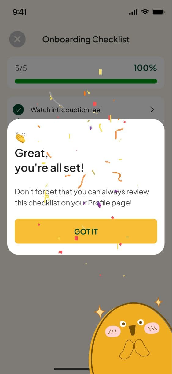
The shift: instead of forcing one path, V2 let users move at their own pace while staying guided.
Results
Onboarding completion rose from 30% to 45% after shipping V2 (a 150% relative increase). One-month retention doubled compared to V1.
Because V2 lets users complete steps independently, per-step completion told a more interesting story than the overall number: every step held above 58%, with no single bottleneck dragging the rest down — unlike V1, where failing one step meant losing the entire flow.
The result confirms the iteration's core insight: the problem was never explaining the method better. It was not forcing commitment before users were ready to give it.