Identifying areas for improvement
Fake Off, a French association led by journalists, fights misinformation among young audiences. At the start of this project, my mission was to propose a plan to enhance their website’s experience, ensuring it could better serve its audience while staying true to the brand’s serious and trustworthy identity.
My process to uncover the right design moves
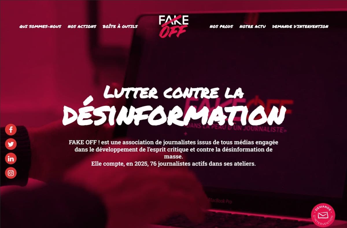
I began with competitor research and a full UX/UI audit. This allowed me to identify opportunities to improve accessibility, hierarchy, and engagement. Based on these findings, I developed a design strategy and prototype, focusing on making the platform more inclusive and user-friendly for both young audiences and educators.
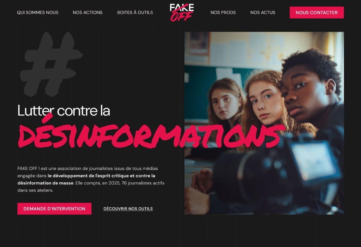
Rethinking the interface to feel lighter, clearer, and more human
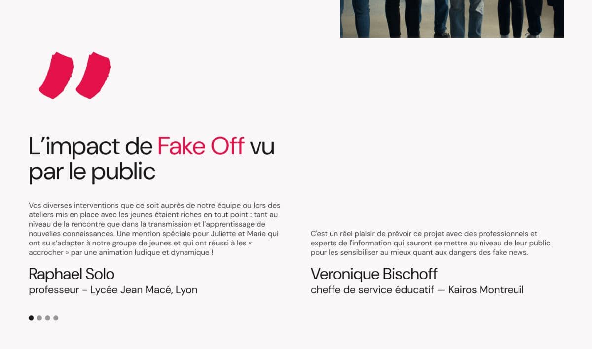
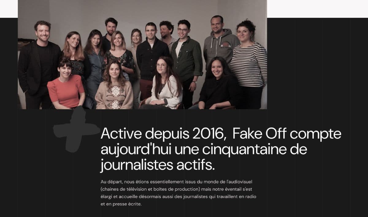
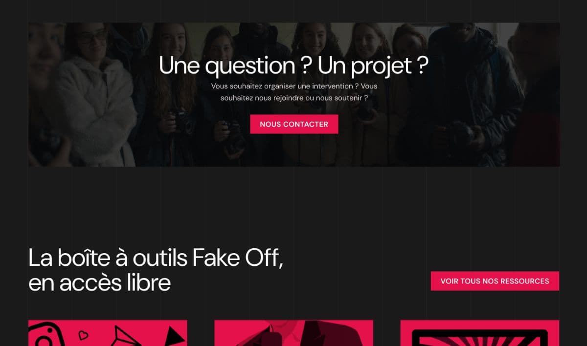
The redesign proposal focused on three key areas of UI improvement: enhancing accessibility through better typography and contrast, softening the visual tone with a lighter and more balanced color palette, and introducing more engaging imagery to support the platform’s educational mission.
These adjustments aimed to make the interface more inclusive and approachable for young audiences, while preserving the credibility and seriousness that define Fake Off’s identity.

Small details matter
During this project, I learned the importance of paying close attention to small details. Even subtle elements—such as text color, typography, or spacing—can significantly impact readability, accessibility, and the overall user experience.
By using visual elements more intentionally, I was able to improve not only the clarity of the interface but also how effectively the message of the website is communicated.
Next project
2024
Adecco France
UX Optimization
Web Design