A community brand whose customers wear headphones
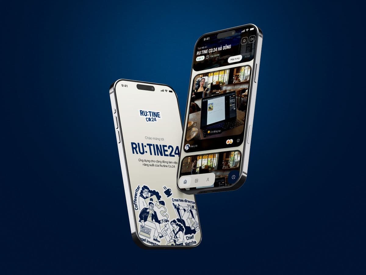
RU:TINE is a Vietnamese working café brand. It sells community, but its customers come to work with headphones on. The founder wanted an app that made that community visible and gave people a reason to come back tomorrow.
I led product design from strategy to handoff, working with the development partner DBLA on a React Native app for iOS and Android, aimed at Vietnamese Gen Z students and young professionals.
Two obvious answers would have failed:
- The transactional trap. A points app people open only to claim a discount. RU:TINE's own competitive analysis had already flagged this as the default failure of café loyalty apps.
- The forced-connection trap. Networking features that assume people want to socialise in-app. In a room of people in flow, a feature that interrupts is not community. It is friction.
Not alone in my grind
Community in a working café is one specific feeling: I am not alone in my grind. That reframed the brief.
We were not building an app that connects people. We were building an app that makes people feel connected.
Strava was the reference. Running stays a solo activity, but Strava makes individual effort visible and shared, and a community forms around it. Nobody is forced to interact. RU:TINE CONNECT applies the same idea to focused work: the session stays personal, and where it lands and who sees it creates the belonging.
I structured the app as three opt-in layers. Someone who only ever uses the timer still gets full value. Someone who goes deeper finds belonging, then a sense of identity. Starting a session and taking the photo is the only consent gesture: nobody is visible to strangers by default, and profiles only open up inside events people chose to join.
1 · Focus
The individual loop
- Timer starts on arrival
- Photo opens each session
- Recap card at the end
- Works with no social use
2 · Community
Ambient belonging
- Live feed, in-store only
- Shows who is here now
- Events run by RU:TINE
- Nobody has to post
3 · Identity
The personal mirror
- Work persona from habits
- Card and stamp collection
- Visit card, mutual adds
- Handoff to Zalo, Instagram
Each layer is opt-in, and Focus alone is a complete product.
Five decisions that shaped the product
Each of these went against a familiar pattern. The reasoning mattered as much as the screen.
- A presence feed, not a content feed. A café has a finite number of daily visitors, and a sparse feed feels lonelier than no feed. So the live feed shows who is here right now, not what people posted, and only to people checked in to the café.
- The photo as a ritual, not a gate. Every session starts with a photo. It marks a fresh start and becomes the texture of the recap card. It is the product's signature moment, so I protected it as a ritual and let the collection carry identity.
- Presence FOMO, not feed FOMO. Every feature had to pass one test: does it reward arriving at the café, or opening the app more? The first serves the business. The second breaks the deep-work promise.
- No in-app messaging, no one-way follows. Vietnamese Gen Z already lives on Zalo and Instagram. The app makes the first gesture, a visit card exchanged by QR at an event, then hands the relationship off. Friends are mutual adds, so there is no follower count to perform for.
- Loyalty that rewards focus, not only spending. Points come from purchases and, at a lower rate, from focus time. It turns point-chasers into feature users, and feature users into point earners.
Shipping it
We planned the build like a startup, not an agency job. Phase 1 was a closed launch that deliberately left loyalty out, to answer one clean question: do the features bring people back on their own? Loyalty, via POS integration, came next as a separate track.
I also built the system that made the design shippable:
- Design tokens in W3C format, exported from Figma to code through a Node.js pipeline and GitHub Actions.
- A re-skinnable theme where each colour carries a job.
- Type: DM Serif Display for moments worth keeping, DM Sans for interface, DM Mono for time and numbers.
- UX writing in English and Vietnamese, with a native Gen Z review before anything shipped.
When a feature was committed to the client without design input (guest-created events), I didn't argue "users don't need it". I reframed it as sequencing and cost, anchored in principles the client had already signed off. It moved to a later phase.
Deep navy
Ground
Warm ivory
Surface
Burnt orange
Action
Amber
Rewards
Teal
Community
What launch taught us
The app launched in mid-2026. The honest result: the focus timer and photo sharing were used far less than we designed for.
They were optional features competing for attention, with nothing that made people start. The community layer, the part the founder cared about most, was the part that landed least.
The principles held up. The incentive did not. A session-completion reward asks for effort before giving anything back. To make the feedback loop measurable, I set the North Star as weekly return rate on completed café sessions, tracked across four groups: focus, presence, identity and product health.
2.0: from one café app to a platform for three brands
Then the client acquired two more coworking café chains and wanted all three in one app. For the new chains the app is mandatory: customers top up a wallet, scan in, and pay for their time.
That changed the design problem. Mandatory payment guarantees usage, but a captive user is not an attached one. My proposal, prepared with DBLA:
- An invisible platform. One account, one wallet, one collection. The app wears the brand of whichever café you check into, built on the same token system with a set per brand.
- Move the reward to check-in. Scan in, get something instantly. No effort before the first reward.
- A collection that develops as you work. You add a concrete goal, "finish my thesis", and it starts as a faint ghost. Focus sessions bring it into focus. Every focus session brings your dreams into focus.
- Social as distribution, not a chore. What people post is an artifact from their collection, so the feed always has something worth looking at.
- A metric that can't be inflated. Not daily actives, which payment props up, but the share of checked-in users who touch their collection.
Keep the principles, change the mechanism
- Test the incentive before the interface. I spent design effort making the recap card beautiful before proving people would finish sessions to earn it.
- Design for the zero-effort first moment. The best features ask nothing on day one. Check-in rewards do that. Session rewards don't.
- Keep the principles; change the mechanism. "Reward arriving, not scrolling" survived launch intact. It is now the spine of 2.0.